We learn to recognize the icons of the Mobile Sites

impariamo a riconoscere le icone dei siti mobile news 1

The evolution of the mobile versions of websites, introduces icons that the user should know to try to orient himself at best.

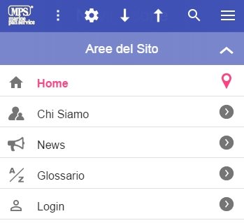
Toolbar icons

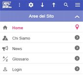
Icone Aree del Sito
Site Areas Icons
Toolbar
Toolbar
Icona Burger
Burger Icon
Icona More
More Icon
Icona Strumenti
Tools Icon
Icone Navigazionali
Navigational Icons
Icona Ricerca
Search Icon
Icona Logo
Logo Icon

The standardization of icons for a mobile site is a process that has yet to begin, so there is no common definition and the meanings often differ greatly from the Android world to that of Apple and up to Microsoft. This guide does not presume to exhaust the subject, but tries to make a minimum of clarity.

Toolbar

In the most recent or better realized mobile sites, the toolbar is retractable. That is, it hides when we scroll to the bottom of the page and reappears when we return up. Even the best browsers have a hidden URL bar, so scrolling the page down will have a full screen view, without the clutter of any toolbar.

So if we feel "lost" because we don't find our toolbars, just scroll up the page and they should reappear. On our site it is hidden but we leave to the user the possibility to make it fixed by acting in the "Tools".

Burger - Navigation (or Nav) Icon

It's called this because it remembers the hamburger icon and it's normally placed on one of the two ends of the toolbar. The Android world advises you on the left and are more frequent sites that place you in this position. We placed it on the right, for our preference in having the logo on the left.
This icon takes us to the Navigation Menu (or NavMenu) which will open the doors to all areas of the site and also to the more specific sections. The most commonly adopted solution is a sliding window that appears from the left.
We have adopted our own solution called NavMenu Semantico (because it does not upset the semantics of the HTML page), where the menu is at the bottom of the page, also to guarantee double access (you can access it not only with the icon, but also with the common "scroll" of the page).

More Icon

The Android world interprets it as "Menu" (for secondary configuration and help actions), but it is generally understood as the "More" icon, i.e. "more information". It is positioned on the opposite side to the Burger.
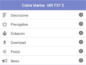
We use it to indicate the section where to find other related pages than the current one, or "more information" than the page. For example, if we are on a product page, More will take you to the section where you can find any product news or links to other related pages, such as the PDF version or the page where you can find other products of the same brand or category.

Tools or Setting

This icon leads to the navigation settings and we can customize some navigation preferences. For example, in our settings page we find the way to activate features, such as the Tilt & Slide (our exclusive function) and other configurations related to graphics or navigation preferences.

Navigational Icons

A distinction is made between those that allow page navigation and those that allow external navigation on a previous or next page (page back / page forward). Inland navigation icons, represented as "up & down" (down/up), are used to quickly go to the top header (the highest part of the page) or to the bottom footer (the lowest part of the page).

While the back & forward icons are more difficult to find on a mobile site, because those supplied with the browser have a more specific and more precise operation. We only use the back icon.

Search

If the site correctly implements this feature (as in the case of most), pressing this icon directly enables the keyboard of the smartphone to type the keyword to search in the site. Once you have typed the keyword you must press the "confirm search" key ("send" or "lens" key, etc., depending on the operating system or digital keyboard set) or press again on the "Search" icon of the Toolbar.

Logo

The logo icon of the site is placed on the toolbar, often in the middle or left and more rarely on the right. In addition to the aesthetic function, it also has the functional function of bringing on the home page of the site. Often it's also a good loophole if something isn't working properly.
Other mobile version icons

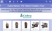
Lista dei titoli di pagina
List of page titles
Swipe per lo Swapping
Swipe for Swapping
Icona Schermo Intero
Full Screen Icon
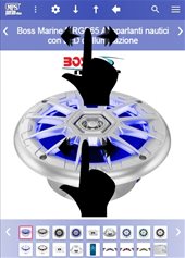
Immagine schermo intero con avviso transitorio
Full screen image with transient warning

The icons in a mobile version are now very popular and are usually monochrome, because they are better distinguishable and do not distort the graphic balance. For example, we find them in the lists, but also in the cards (they are those rectangular objects in the shape of a credit card and that have a slight elevation with respect to the plane) and in other elements. There are also icons that have a navigational bearing that are those that we illustrate in this paragraph.

Swapping

Swapping means exchanging, in this case, the images or contents of a carousel. On a piece of furniture, the operation is also carried out with a swipe, i.e. by dragging the finger in one direction. Swipe normally involves sliding, i.e. the transition from one slide to another.

The left/right arrow icons usually also want to denote the presence of a swipe area. But the arrows themselves, if pressed, reproduce the swipe effect, which is very useful especially if the swipe is not working well. Unfortunately, the malfunction of the swipe is recurrent and can be of various kinds (hardware, software, etc.).
It should also be remembered that on the most modern devices, the swipe rather than being a real swipe, consists of a small tap in one direction.

Full Screen

This mode is not yet very popular, because only recently browsers have opened to developers of mobile sites this possibility. In practice, the icon leads to full screen mode and the browser requires prior confirmation from the user whether or not to accept this mode.

There is no doubt that mobile sites will increasingly have this feature and will probably adopt the same mechanism as on our site. When we click on an image, many sites take you to a "modal" window (i.e. a page where actions for the user are limited to a few specific actions) and the image appears in large size. The full screen icon should appear in this window.

By pressing the full screen icon, the image becomes even larger and spans the entire size of the screen, just like the photos we took with our smartphone, i.e. we can handle full screen images that run in sequence with the swipe.
To see how it works, click now on a nice image.

Other useful tips

Landscape per caratteri più grandi
Landscape for larger characters
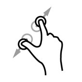
Pinch Zoom
Pinch Zoom

Landscape for larger characters

For those who find it hard to see up close, rotating their smartphone on the landscape view is the fastest way out (provided the mobile site provides this help).

The Safari browser automatically adopts this technique, but should instead be a solution that should start from the developers of the site who know better the graphic particularities of their pages. However, in addition to our site, more and more mobile sites are moving towards this technique and we hope that many more will follow the example to allow a good browsing experience even to those who with eyesight "struggle".

No Pinch Zoom

Unfortunately today most mobile sites (including ours) do not enable the very useful function of pinch zoom (magnification of the area with two fingers). For security reasons, browsers today do not offer developers the ability to have full control over the zoom to correct some unwanted actions. We hope that there will be an evolution in this direction in the coming years ...