
If you have not yet done so, please read the general advice we have released for navigation on mobile sites first, with the following news:
Let's learn to recognize the icons of mobile sites
Do not hesitate to click ...
Our site does not use banners, self-rotating carousels or some kind of "traps", only the user's input generates actions and animations that try to meet his expectation.any image, list, card and the many Wikilinks (see images to the side for clarification) that are on the text, all release at least one action. The first suggestion is therefore not to hesitate to click on an image or any other object, because the action will always be linked to a relevant effect and at the same time you will have a greater perception of the "geometry" of our site.
Sliding Header
The sliding header is one of the most important elements of navigation in our site and is present in almost all pages, so you need a careful explanation.
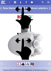
Acting with the swipe or pressing on the arrows (those placed higher), we will have a related page.
Let's take an example directly: we clicked on the logo of one of our brands and from the list of products we clicked on one of them. By acting on the sliding header we will have a product of the same brand in the same order that appeared in the previous list. If we go back to the list of products of the brand, we will browse all the brands, according to the order that appears in the NavMenu in the section "Products of the Major Brands".
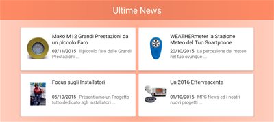
The same type of operation occurs on virtually all pages and in all areas of the site (Glossary, News and About Us).
In the sliding header area of the single product we also have the peculiarity of double swapping: in the upper part we scroll the related pages, in the lower part all the images of the single product, but only in case the swapping for the related pages is not active.
An important note concerns the exit from the sliding header, this feature does not take you directly to the page shown on the slide, but only on a preliminary of it, to get the entire page, you need to request it or wait for the timeout. To request it, just click on a free area of the slide, or click on the button that appears at the bottom, or scroll (we recommend upwards to avoid unwanted graphic effects).
Colors Area
Each area of the site is distinguished by a color that should help users to orient themselves between the various sections of the site. The home page and the entire product area have the dominant colour (indigo), while the News, Glossary, About Us and Reserved Area each have a distinctive "palette".